Loving Navigation:
Spatial Awareness through Tactile Maps
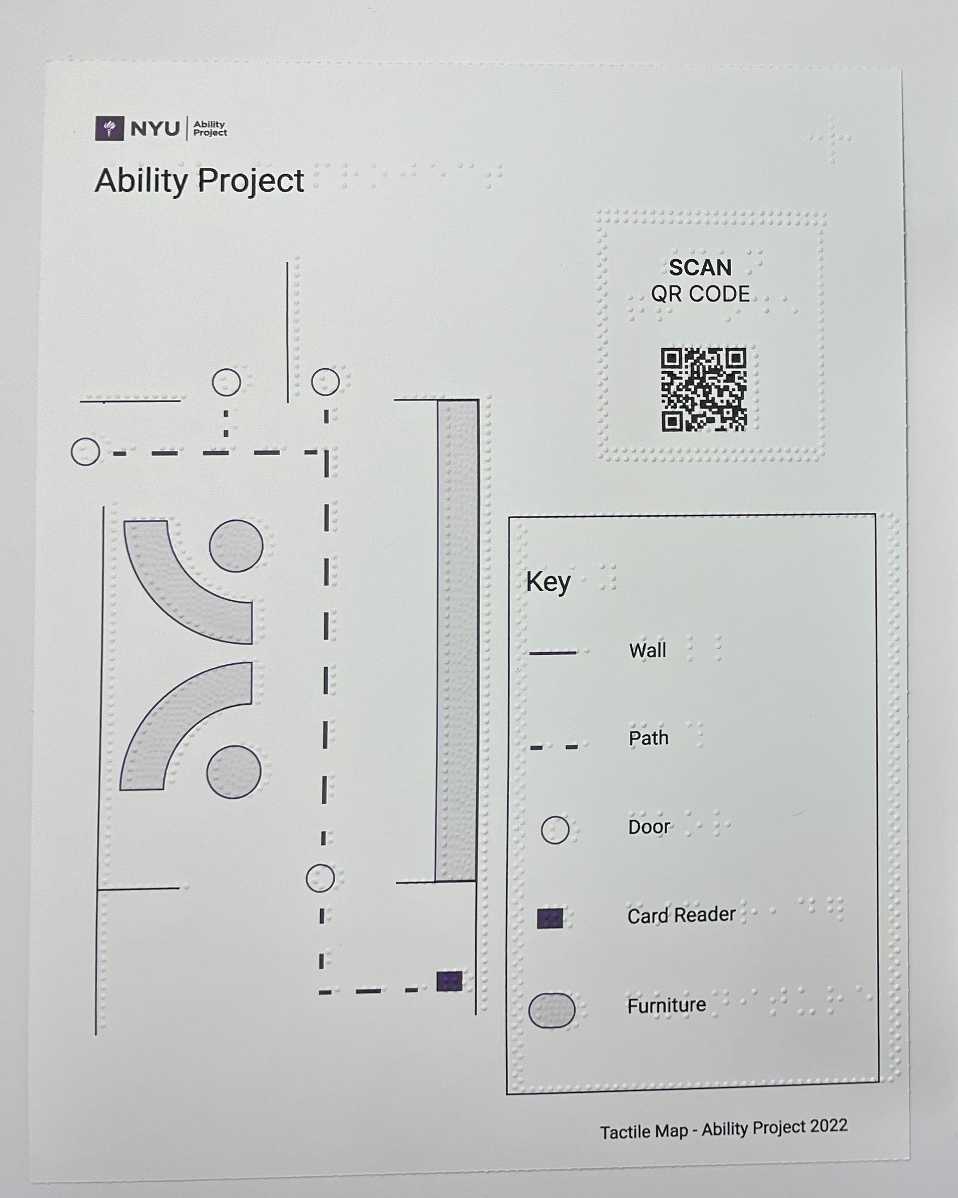
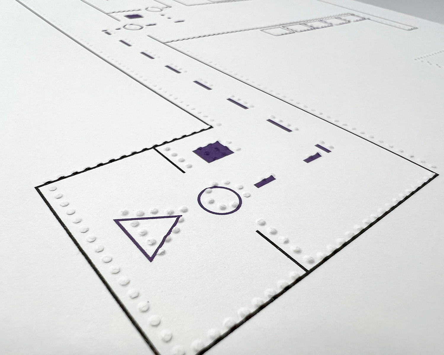
Photo: Swell Form Paper Tactile Map
With an Accessibility-Centered approach, we establish design guidelines for the creation of tactile maps, aimed at improving indoor navigation. This system is currently being tested at NYU’s Ability Project Lab.
Role: Accessibility UX Designer
Collaborators: Spandita Sarmah, Dr. Amy Hurst, Caitlin Graham
Toolkit: Braille Embosser, Swell Form Machine, Figma, Ps / Ai, Word Processor
Duration: 6 months
Problem
Few public spaces have material for facilitating navigation. Even fewer make this information accessible to blind and low-vision users. Adding to the complexity, many of the solutions available require an investment and special knowledge, which makes accessibility and maintenance difficult.
The goal of this project is to create a simple yet comprehensive approach to improving the navigation of NYU’s Ability Project and its facilities.
Objectives
Support the evaluation of indoor spaces through navigation material.
Develop a design system to ease the creation of tactile maps.
Generate a solution that is easy to use, adapt and replicate.
Create multiple mediums of interpretation of the maps: tactile, audio, braille, and visual.

Solution
Develop a novel approach to designing paper-based tactile maps, as well as an evaluation system for indoor navigation materials; Centered on blind and low-vision users.
This system was used to generate tactile maps and navigation guides for the NYU Ability Project’s facilities.
Impact
Community Impact and UX Practice - Implemented first tactile maps and navigation guides at NYU Ability Project Facilities. Material with audio navigation.
Design Documentation - Developed and published design guidelines and design systems.
Cultural Influence - Navigation resources (on-site and online) focused on blind and low-vision visitors are currently available at the Ability Project and expanded to near facilities.
Team Process - Tighten team relationships through weekly meetings. Improve design process and distribution of tasks, accountability, and design reviews. Share insights on tactile design and workflow with parallel teams.
Giving Back - All deliverables are Open Source to anyone who wants to improve navigation from an accessibility-centered process.
Outcome

Design Process
Uncover the needs - Assess the challenges of the facilities with orientation and navigation specialists.
Prototype and testing - Partnered with UX researcher to test Usability at the early stages of prototypes.
Design Documentation - Create Tactile Maps with Design System and Guidelines
Released - Tactile Maps and Documentation at NYU’Ability Project and facilities.
-

Identify
Secondary Research
Orientation & Mobility Specialist Assessment
Competitive Analysis
-

Define
Problem Statement
Objectives
Gather Research Findings
-

Ideation of Possible Solutions
Identify the areas with more potential
Explore ideas - Hand-On
Evaluate scope, timeframe and impact value.
-

Creating a Prototype
Braille-first Design
Tactile Graphic: Swell and Embosser
Audio Map Description
-

Testing and Iterate
Test Maps with target users
Iterate maps through the process
-

Making improvements and releasing project
Documentation and Workflow released
Design Style Guide
Design Guidelines
Beta Testing
Research Process
Interview with Orientation and Mobility (O&M) specialist from The Helen Keller Services.
Evaluation of indoor navigation at NYU’s Ability Project facilities with O&M specialist.
Field research at The Helen Keller Services to research navigation in a space centered on the Blind and Low Vision community.
Conduct secondary research on indoor navigation, tactile maps, and spatial tracking.
Test tactile maps and gather feedback from potential users.
Usability Testing and Iterations
Multiple maps were designed and tested. We aimed to improve the readability of the maps in a letter-sized paper format.
Key takeaways from evaluations:
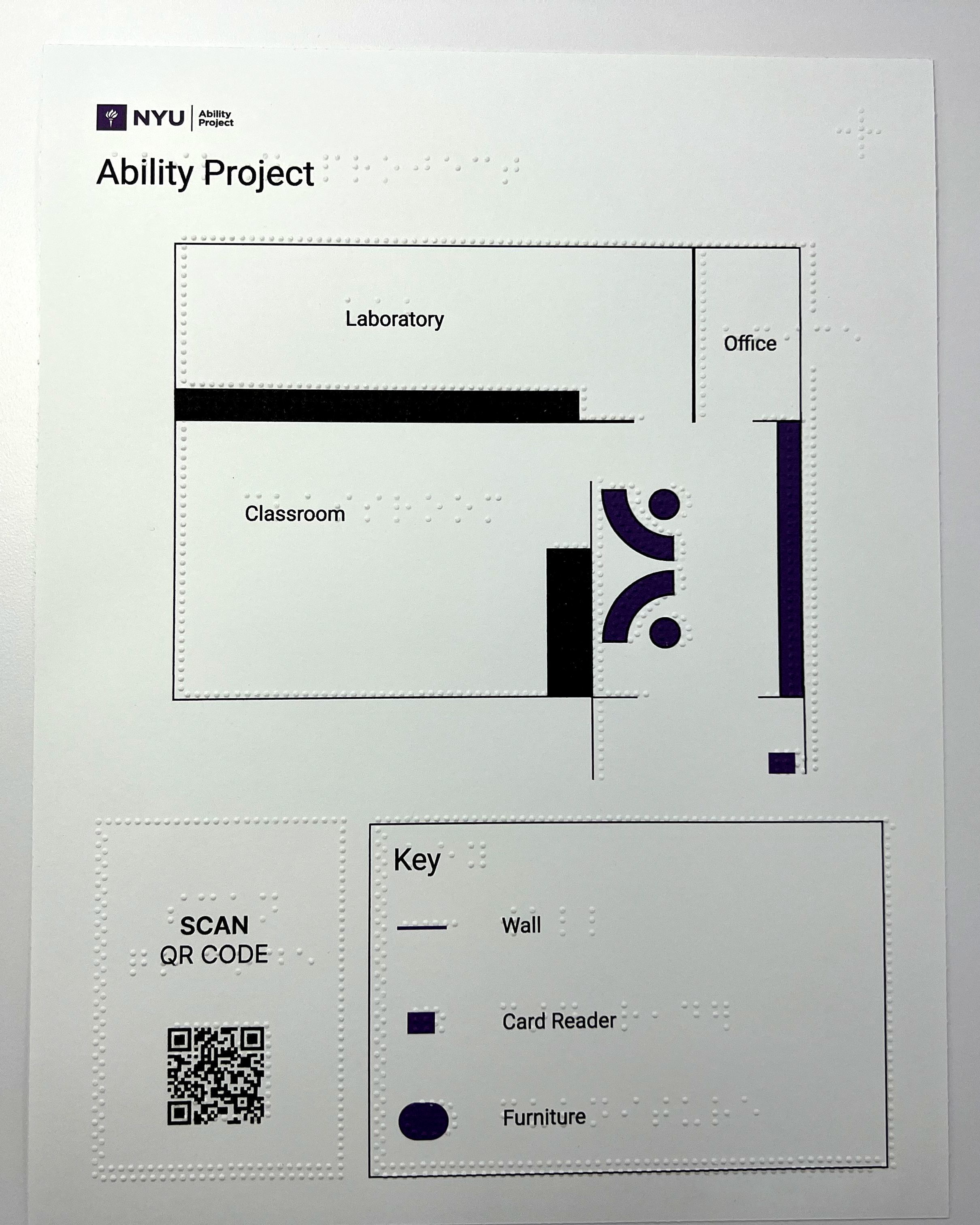
Always keep the Key (legend) in the same location on the paper.
Create a thick outline that differentiates where the Key is positioned.
Create an alternative interpretation of the Key for non-braille readers.
Screen reader technology was chosen over an audio description given that it is more adaptable than pre-recorded audio.
Design Insights
Designing For Touch - To make the design more readable, keep “breathing room” between elements of the document and maintain consistency in the elements and components. Avoid tactile clutter.
Visual Information Layer - Improve the usability of the maps, by adding visual information and reducing tactile clutter.
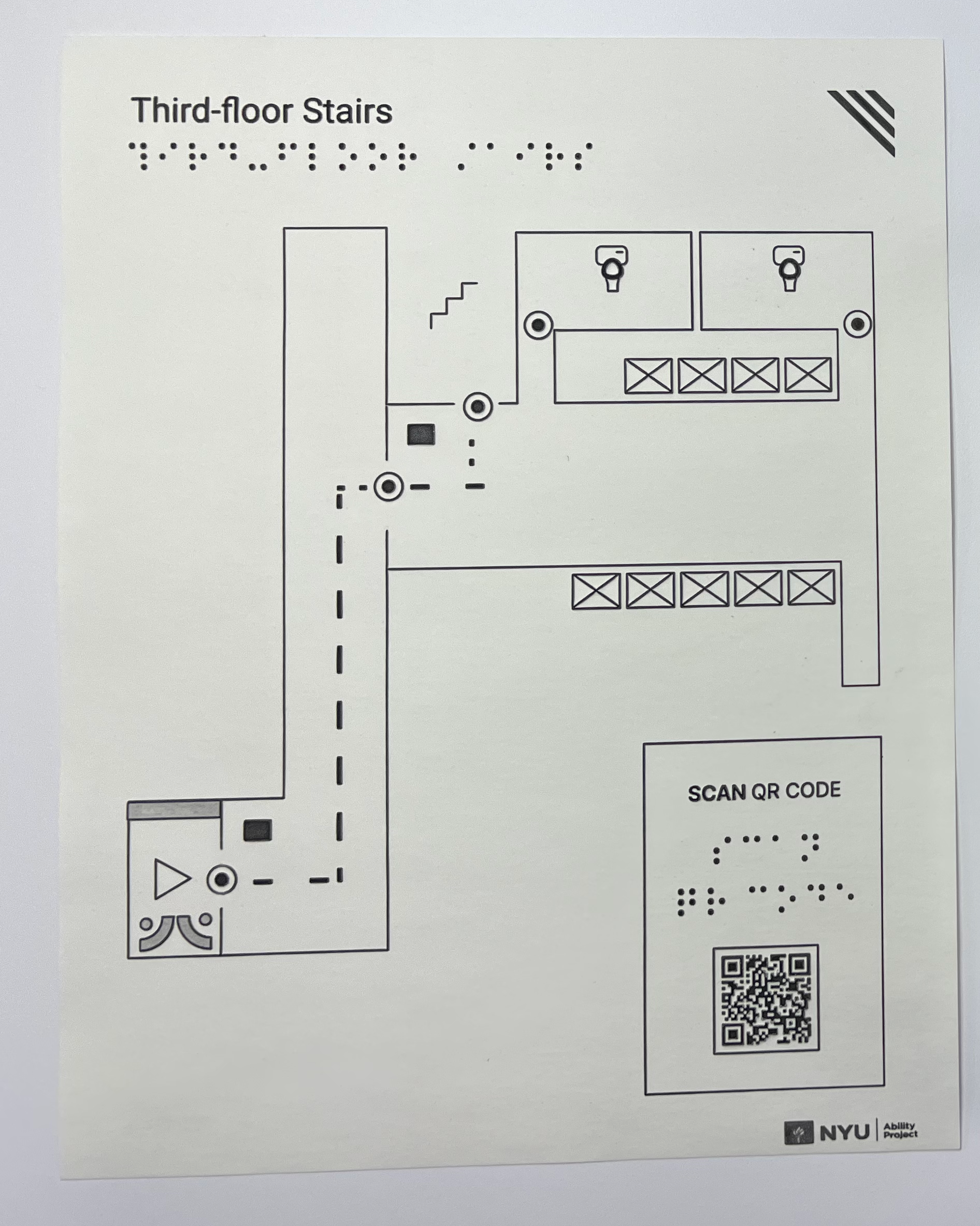
QR Code for Audio Description - The QR Code connects the user to an online page that describes the tactile map. This description can be accessed by using a screen reader. A tactile graphic guides the user to the location and size of the QR code.
Symbols
Design Symbols that are compatible with the printing method:
The Braille Embosser has a limited capacity for details on smaller graphics. For better tactile interpretation, avoid complex and detailed shapes.
Swell Form Graphics allow for a higher level of detail compared to the Braille Embosser. On the other hand, the braille text is less clear than with the Braille Embosser.
Innovation through Accessibility
Improving usability with both Tactile and Visual layers.
Tactile maps have two layers of information: one includes the tactile material and the second includes the visual details.
The design and printing process uses paper for the tactile printer method (Braille Embosser or Swell Form) and an ink printer for visual information only. This increases the usability of the maps, translates braille to text, adds visual information, and reduces tactile clutter.
Tactile QR Codes
What is the tactile equivalent of the recognizable QR Code?
After some iterations and research on QR Codes, I created a tactile symbol for a QR Code: Its shape (a square) and its position markers. This tactile icon indicates the position, size, and orientation of the QR Code. Users locate the QR Code to access a description of the tactile map using a screen reader on a smart device. Screen reader technology is chosen over an audio description given that it is more adaptable than pre-recorded audio.


Lessons Learned
Evaluate alignment in the early stages of the process.
Some explorations later discarded consumed valuable time at the beginning of the ideation process. Defining better the scope, timeframe and impact value, make me reassess the design solution. The more rational and straightforward the idea, the closest-align with the existing process and resources.
Tactile clutter and Information overload.
Designing for paper-based tactile maps came with challenges on how much information can actually be added without faulting in tactile clutter. The limitation of the paper make me reassess the information added, design, and technical methodology. Finally, in the end, I developed the tactile maps in two paper-based mediums.
Takeaways
Accessibility-Centered Design
I started this project thinking about inclusion and advocating for the user. Driven by an accessibility-first mindset, I found that this approach led me to find a novel way to design and enhance the experience. Designing for accessibility makes the experience better for everyone!
Design System and Design Guidelines
The value of this project exists in its replicability. For this, it was important to develop comprehensive design guidelines, as well as a style guide. By creating a design system I understood the mediums, and which iconography works better for each medium.
Loving Navigation
My love for navigation was born from this project. Seeing the many ways that people orient themselves in a space helps me understand how we can discover spaces (physical or digital) and build experiences that are more equitable and inclusive.
Acknowledgments
This project was developed with the help and feedback of Dr. Amy Hurst, Dr. Anita Perr, Caitlin Graham, Gus Chalkias, Lauren Race Regine Gilbert, Spandita Sarmah, and Tom Igoe.


